More than 1 in 4 adults in the United States live with a disability, and globally, about 1 in 6 people experience significant disability. That means accessibility is not a side conversation at your event. It is the conversation if you want your merch to actually land.
The best branded gifts are not just cool to look at. They are easy to wear, easy to hold, easy to open, and comfortable to keep around long after the event wraps. When you build with that mindset from the start, your merch stops feeling like a generic giveaway and starts feeling like real hospitality.
What “Accessible Merch” Means (And Why It’s Better Merch)
Accessible merch is not pity merch, and it is definitely not boring merch. It is well-designed merch that works for more people, in more situations, with less friction.
At JNP Merchandising, we think of accessible merch as the sweet spot where function, style, and comfort all show up together. It means asking better product questions before you ever approve a mockup:
- Can someone use this with one hand?
- Is the material irritating, noisy, or overstimulating?
- Is the branding readable at a glance?
- Will the packaging frustrate people before they even get to the item?
- Does this product feel wearable across a real range of body types and sensory preferences?
That is where inclusive merchandise starts. And honestly, it usually ends with better merchandise overall. The same design choices that help disabled and neurodiverse attendees also help tired travelers, people carrying bags, guests with temporary injuries, older attendees, and anyone who just wants things to be simpler.
A smart accessibility mindset also signals something important about your brand. You notice people. You thought ahead. You did not make attendees work hard just to enjoy a gift.
Sensory-Friendly Materials and Textures
If a product looks great on a flat lay but feels scratchy, plasticky, stiff, or noisy in real life, it is already losing.
Sensory-friendly swag should prioritize comfort first. Think washed cotton, tagless tees, brushed fleece, soft-touch finishes, and fabrics with some give. Avoid heavy seams, abrasive tags, crackly packaging, and gimmicky textures that look interesting but feel unpleasant during actual use.
A few material choices we love:
- Tagless or tear-away label apparel
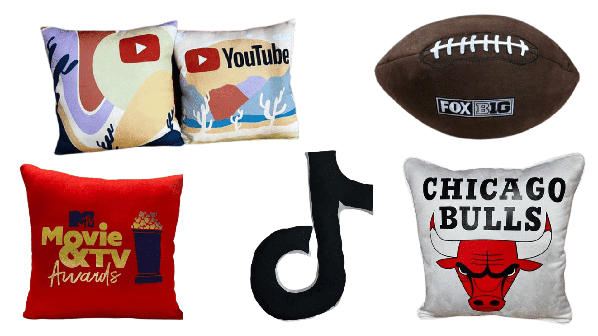
- Soft fleece blankets or pillows for events for lounges, wellness corners, and recovery spaces
- Microfiber or cotton-based items that feel calming in the hand
- Matte or soft-touch coatings instead of glossy, squeaky finishes
Pro tip: do a real tactile review, not just a visual one. Pass samples around. Touch them with dry hands, lotion-coated hands, cold hands, and after they have been sitting in a box for a week. If the first reaction is “cute, but kind of irritating,” move on.
For neurodivergent attendees and others with sensory sensitivities, texture can make the difference between a product that gets used every day and one that gets tossed in the bottom of a tote.
Inclusive Sizing and Fit Choices
Nothing kills the vibe faster than “unisex” merch that is basically just a narrow size run with optimistic labeling.
Inclusive sizing means offering a range that reflects real bodies, not just the easiest inventory setup. It also means thinking beyond size numbers and paying attention to silhouette. Boxy fits, relaxed cuts, adjustable waists, and softer stretch fabrics often give people more room to self-select what feels good.
A few sizing moves that consistently work:
- Offer extended sizes as a default, not as a special request
- Include a fit guide with garment measurements, not just S through 3XL labels
- Prioritize relaxed and oversized cuts over ultra-fitted styles
- Give attendees a choice between at least two silhouettes when budget allows
This is also where product mix matters. Not every attendee wants apparel. Some would much rather receive a premium usable item than gamble on fit. Soft accessories, bags, blankets, desk items, and comfort products can make your merch program feel more inclusive without turning sizing into a logistical mess.
The goal is not perfection. The goal is reducing the number of people who feel like your product was never designed with them in mind.
Packaging That’s Easy to Open and Easy to Use
You can choose the perfect product and still ruin the experience with impossible packaging.
Accessible packaging should be simple, low-force, and intuitive. If attendees need two hands, long nails, or a mini engineering degree to open your gift, that is not premium. That is annoying.
Here is the packaging checklist we keep coming back to:
- Easy-tear or pull-tab openings
- Minimal twist ties and hard plastic seals
- Labels that use clear language instead of cluttered microcopy
- Readable text with strong contrast
- QR codes paired with plain-language instructions, not used as the only instruction method
Low-waste packaging can also support accessibility when it reduces layers, stiffness, and excessive wrapping. Less material often means less struggle.
And do not forget labeling. Clear instructions matter. If you are including care directions, tech setup guidance, or redemption steps, write them so people can understand them the first time. Clean hierarchy, generous spacing, and obvious next steps go a long way.
Products That Work for Mobility and Dexterity Needs
This is one of the easiest places to separate thoughtful merch from merch that just looks thoughtful.
Mobility- and dexterity-friendly products are usually lightweight, balanced, easy to grip, and not overly dependent on tiny parts or high force. Think wider handles, simple closures, and products that do not demand fine motor precision.
Good options often include:
- Easy-grip water bottles with loop handles
- Lightweight crossbody bags or totes
- Chargers and tech accessories with straightforward connections
- Zipper pulls that are easy to catch
- Soft custom football towels that can be used as practical event gear, cooling accessories, or comfort items
What we would skip for accessibility-first kits:
- Overly stiff carabiners
- Tiny screw-top containers
- Hard snap closures
- Products with complicated assembly or setup
A good rule is this: if a product becomes dramatically harder to use with limited grip strength, reduced coordination, or one-handed use, it needs another round of thinking. The win is finding items that feel elevated without feeling fiddly.
Visual Accessibility: Color Contrast and Readability
Some merch is technically branded, but functionally unreadable.
If your logo disappears into a trendy tonal palette or your care card uses tiny gray text on cream paper, you are designing for the mockup, not the attendee. Visual accessibility is about helping people understand the product fast and comfortably.
That starts with contrast and typography. Use bold enough color pairings, readable font sizes, and simple typefaces that do not fight for attention. If the product includes printed instructions, product naming, or event information, make the content scannable.
Our favorite rules of thumb:
- Prioritize contrast over subtlety
- Use larger type than you think you need
- Avoid ultra-thin fonts for practical information
- Keep icon systems simple and consistent
- Do not rely on color alone to communicate meaning
This is especially important when packaging includes instructions, schedules, redemption steps, or product features. Following guidance like WCAG contrast recommendations and readable headings and labels guidance is not just for websites. It is a strong mindset for physical merch touchpoints too.
Hearing and Neurodiverse-Friendly Event Items
Not every attendee wants more stimulation. A lot of people want less.
That is why the smartest event kits often include grounding items, quiet comfort items, or products that support self-regulation without making a big show of it. The key is to design for dignity. Make the items stylish and normal enough that anyone would be happy to receive them.
Some event-friendly choices:
- Soft-touch notebooks
- Smooth stress tools or quiet fidget items
- Weighted-feel mini comfort items where appropriate
- Sunglasses for bright environments
- Soft zip pouches for organizing essentials
- Lounge-friendly pillows for events in recovery spaces, VIP quiet zones, or wellness activations
Also think about the total kit experience. If every item lights up, rattles, crinkles, or vibrates, the collection may feel chaotic. A calmer assortment often reads more premium anyway.
For event planners, this is a huge opportunity. A sensory-considerate merch strategy does not just serve autistic attendees or people with sensory sensitivities. It makes the event feel more breathable for everyone.
How to Offer Choice Without Adding Complexity
Choice is one of the most inclusive things you can build into merch, but only if the system is actually easy to use.
Instead of forcing every attendee into one standard kit, consider a pick-your-item or pick-your-size flow. Let people choose between apparel and non-apparel. Let them select preferred colors. Let them opt into shipping later if carrying items around the venue is a burden.
The trick is keeping the choices curated:
- Two apparel silhouettes, not ten
- Three gift options, not a giant catalog
- One simple redemption path
- Clear deadlines and confirmation language
A short pre-event preference form can help you collect useful details without getting invasive. Ask about size, product preference, shipping needs, and maybe favorite category. Skip anything that feels overly personal unless there is a clear accessibility reason and a thoughtful privacy approach behind it.
This is also where experience matters. We have seen firsthand through programs like our Wesleyan University championship merch rollout that tailored fulfillment creates a stronger emotional response than one-size-fits-all giveaways.
Partnering With Vendors Responsibly
Inclusive sourcing is not just about the finished product. It is about how you get there.
Your merch partner should be able to talk clearly about fabric feel, print durability, packaging options, sample testing, and what happens when a product does not perform in the real world. If they cannot answer basic usability questions, that is your sign.
Ask vendors things like:
- Can you provide physical samples for tactile review?
- Are there tagless or soft-label options?
- Do you offer extended sizes consistently?
- Can packaging be simplified?
- Can you test readability on print pieces before production?
- What quality checks happen before fulfillment?
This is where inclusive design guidance from Microsoft is such a strong mindset shift. The best design teams do not treat exclusion like an edge case. They build with it in mind from the beginning.
Responsible vendors also understand communication. They can help you create easier-to-read inserts, cleaner product instructions, and smarter selection flows using plain language principles and effective communication guidance.
Inclusive Merch Makes More People Feel Welcome
Accessible swag is not a niche trend. It is what better merch looks like when you design with real people in mind.
When your gifts are softer, easier to use, easier to read, more flexible in fit, and calmer in experience, more attendees get to participate without friction. That is good design. That is good hospitality. And yes, that is good branding too.
The takeaway is simple: inclusive event merchandise does not ask people to adapt to the product. It adapts the product to the reality of the audience. That shift is where the best merch programs live, and it is exactly where JNP Merchandising loves to work.