If you have ever wondered why some merch instantly feels “on brand” while other merch feels like a random freebie, it usually comes down to one thing: clarity.
In fact, consumer research shows 78% of people enjoy receiving promotional products from brands they love, which is your reminder that merch is not fluff. It is a real relationship-builder when it is done with intention. The mood board is how you translate that intention from your head into something your team can actually design, source, and produce.
Think of it as the bridge between brand identity and the physical product your audience will actually want to keep.
Understanding the Importance of Merchandising Mood Boards
A merchandising mood board is not just a pretty collage. It is your brand, translated into a visual language that product decisions can follow. When you are moving fast and juggling options like colorways, materials, print methods, and packaging, a mood board keeps you from accidentally drifting into “that’s cute” territory instead of “that’s us.”
The real power is alignment. A strong mood board:
- Keeps stakeholders focused on the same vibe and standards
- Speeds up approvals because decisions feel more obvious
- Makes product selection easier because you have a clear filter
- Protects your brand from mismatched finishes, fonts, and styles
Pro tip: If your mood board cannot answer “Would our brand wear this?” in two seconds, it is not ready yet.
Defining Your Brand Identity Before You Begin
Before you touch Pinterest, take ten minutes and define your brand identity in plain language. Not corporate fluff. Real words. Mood boards only work when the inputs are honest.
Start with these five anchors:
- Brand values: What do you stand for when no one is watching?
- Target audience: Who are you trying to impress, help, or win over?
- Brand personality: If your brand walked into a room, what energy would it bring?
- Visual aesthetics: Minimal and modern, bold and playful, elevated and timeless?
- Non-negotiables: The “we never do that” list.
Then write a one sentence “merch mission.” Example: “Our merch should feel sleek, city-smart, and premium enough to gift to a client without thinking twice.”
Pro tip: Avoid generic personality words like “innovative” or “high quality.” Everyone says that. Choose contrast words like “sharp but warm,” “luxe but not flashy,” or “sporty with polish.”
Gathering Inspiration: Where to Look and What to Include
Inspiration is not the goal. Curated inspiration is the goal. The difference is everything.
Here are a few places that actually deliver:
- Your own brand ecosystem: Website, social feed, pitch decks, event photos, packaging, past merch wins and fails
- Retail and hospitality brands you respect: Look at how they use texture, tone, and restraint
- Material and print suppliers: Swatch books, finish samples, embroidery thread charts, packaging catalogs
- Competitor analysis: Not to copy, but to identify what you want to do differently
- Trend research: Use it lightly, like seasoning, not the main ingredient
What to collect:
- Color palette references (primary, secondary, neutral)
- Typography vibes (not just fonts, but how type is used)
- Product silhouettes (totes, drinkware shapes, apparel fits)
- Texture and material cues (matte, glossy, soft-touch, ribbed, brushed metal)
- Photography style (studio clean, candid lifestyle, high contrast, airy)
- Packaging direction (minimal sleeve, rigid box, tissue and sticker moments)
Pro tip: If your inspiration board feels chaotic, you have not narrowed your “why.” Delete ruthlessly. You are not building a museum, you are building a product direction.
Selecting Visual Elements that Embody Your Brand
This is where the mood board starts acting like a real merch blueprint. You are selecting elements that are not just pretty, but strategic.
Color
Choose 3 to 5 core colors, then define how they show up on product. Bright color on a website can feel completely different on fabric, metal, or ceramic. Decide now whether your brand reads best in:
- High contrast (bold, confident, loud)
- Tonal neutrals (clean, elevated, calm)
- A single signature pop (minimal but memorable)
Pro tip: Pick one “hero color” and one “quiet color.” The hero makes you recognizable. The quiet color makes you wearable.
Typography and marks
Logos do not live the same way on merch as they do on a website. Embroidery, screen print, debossing, and engraving all behave differently. On the mood board, include examples of:
- Small, minimal logo placements
- Oversized statement placements
- Tone-on-tone branding
- Icon-only applications (no wordmark)
Pro tip: If your logo only looks good huge and full color, you are going to feel limited in real production. Include alternative lockups early.
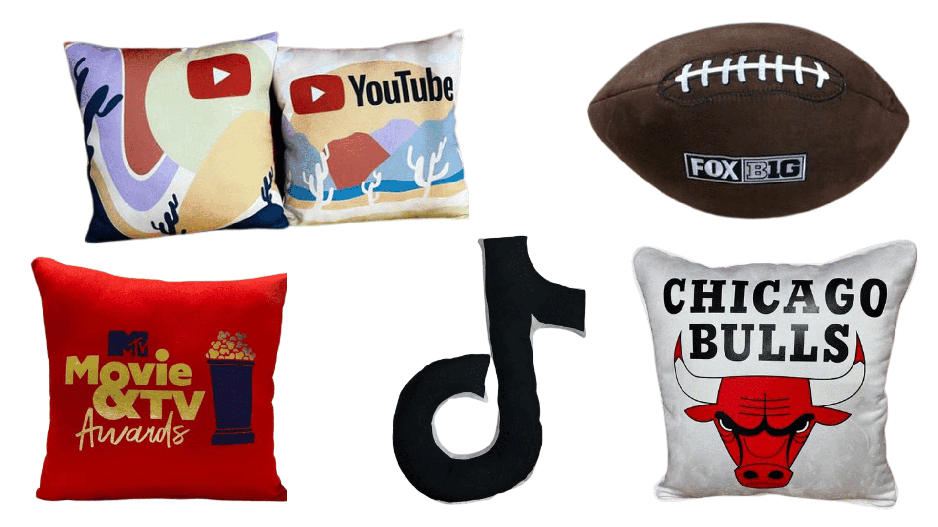
Product imagery
Do not just pick “cool products.” Pick products that match your brand’s lifestyle and value signal. A premium brand might lean into heavy drinkware, elevated packaging, and clean apparel fits. A playful brand might lean into color, novelty, and bold graphics.
Pro tip: Put two columns on your mood board: “On brand” and “Off brand.” The off brand examples teach your team faster than any lecture.
Materials and textures
This is where merch becomes memory. Include swatches and finishes that match your brand’s feel, such as soft-touch coatings, ribbed knits, structured canvas, brushed stainless steel, recycled paper, leatherette, or silicone accents.
Pro tip: If you cannot describe your brand with a touch word, you are missing a major merch opportunity. Words like “smooth,” “grippy,” “plush,” “structured,” or “sleek” are secretly design instructions.
Organizing Your Mood Board for Clarity and Impact
A mood board that looks gorgeous but confuses everyone is basically wall art. The goal is clarity and direction.
Digital vs. physical mood boards
- Digital boards are perfect for collaboration, quick edits, and remote feedback.
- Physical boards are best when material feel is a key part of the concept, especially for apparel, packaging, and premium finishes.
If you can, do both. Start digital, then finalize with a small physical kit of swatches and samples.
A layout that tells a story
Organize by sections that mirror how merch decisions get made:
- Brand vibe: 6 to 10 images that set the emotional tone
- Color system: swatches with notes on how to use them
- Typography and branding: logo treatments, placements, icon style
- Material direction: fabrics, finishes, packaging textures
- Product lane: 8 to 12 product references that fit the vibe
- Do and do not: guardrails to prevent drift
Pro tip: Add short captions to your board. One sentence notes like “matte black hardware only” or “tone-on-tone embroidery preferred” save you from endless back-and-forth later.
Translating the Mood Board into Physical Product Concepts
This is the moment where we turn “vibes” into actual merch you can quote and produce.
Step 1: Create 2 to 3 concept lanes
Most brands need more than one lane, especially if you serve different audiences or event types. Build lanes like:
- Core essentials: the everyday pieces that stay consistent all year
- Event flex: statement pieces for launches, conferences, or VIP moments
- Seasonal or limited drops: trend-forward, fun, and time-based
Pro tip: Each lane should have its own mini mood board slice. Same brand, different volume.
Step 2: Map visuals to product decisions
For each lane, translate visual cues into specs:
- “Clean, minimal” becomes subtle logo placement, tonal print, and premium finishes
- “Bold, energetic” becomes high contrast color, larger graphics, and playful packaging
- “Eco-forward” becomes recycled materials, minimal packaging, and durable reusables
Then choose products that naturally carry those specs. Example: If your board screams “sleek and premium,” a lightweight, flimsy tote is going to fight you. Go structured canvas, elevated stitching, and a clean imprint.
Step 3: Prototype the feeling, not just the object
Ask for samples, swatches, and mockups. A digital render can look perfect and still feel wrong in-hand. Pay attention to weight, hand-feel, zipper quality, stitching, lid tightness, and how the branding reads in real light.
Pro tip: When you are unsure between two options, choose the one that feels more like your brand when you close your eyes and touch it. That is the whole point of merch.
Tips for Presenting and Communicating Your Vision Effectively
A mood board is only powerful if other people can immediately “get it.” Your job is to make the vision easy to approve and easy to execute.
Present like a merch strategist
When you share the board, frame it with three quick points:
- Audience: Who this merch is for
- Moment: Where it will be used or gifted
- Message: What the product should say about the brand without words
Then walk stakeholders through your concept lanes and show how each product choice ties back to the board.
Build in feedback without losing control
Feedback is good. Random feedback is chaos. Give people a structure:
- What feels most on brand?
- What feels off brand?
- What is missing for this audience or moment?
- What would make this feel more premium or more usable?
Pro tip: Do not ask “Do you like it?” Ask “Does this feel like us?” That question protects the brand.
And if you are planning regional events and want your merch to hit the right notes in-market, keep it local-smart, too. If you are hosting events in Massachusetts, our promotional products in Boston can help your brand stand out in a crowded market.
Leave them with a takeaway slide
End your presentation with a simple summary:
- 3 keywords that define the vibe
- 3 product categories you are prioritizing
- 3 execution rules (logo placement, finishes, packaging standard)
That one slide becomes the north star when the project moves into sourcing and production.
Harness the Power of Mood Boards to Bring Your Brand Identity to Life in Every Product Line
A merchandising mood board is how you stop guessing and start designing with confidence. When it is built on real brand identity and organized with clear product direction, it becomes the fastest path from “this is our vibe” to “this is the exact merch we should make.” The takeaway is simple: build the board like a strategist, not like a scrapbook. Your audience will feel the difference the second they hold the product.