Personalization works because people love merch that feels like it was made for them, not handed out the same way to everyone. In fact, Deloitte found that 80% of consumers prefer brands that offer personalized experiences, which is exactly why live customization stations continue to draw crowds.
But the difference between a packed, high-energy activation and a slow-moving line with frustrated guests usually comes down to one thing: design decisions made before the event starts. If you want fast on-site personalization, the products, fonts, placements, and rules all need to be built for speed.
Why “Design for Speed” Matters in Live Personalization
A lot of brands think speed is about staffing. It is, a little. But more often, speed is a design problem wearing an operations outfit.
When a station gets backed up, it is usually because the guest has too many choices, the artwork has too much detail, or the team has to keep stopping to clarify what goes where. That is why designing for speed matters. You are not just designing something that looks good in a mockup. You are designing something that can be approved, produced, checked, and handed off in a few minutes without the line collapsing.
Fast personalization usually comes from a tight system:
- a product with a clean printable area
- a short list of font choices
- pre-approved placement zones
- character limits that protect the machine and the look
- an easy proofing workflow at the station
This is where experienced merch planning really shows. The coolest activation is not the one with the most options. It is the one that feels premium while still moving.
Pro tip: if your guest needs more than 10 seconds to decide, your menu is too big.
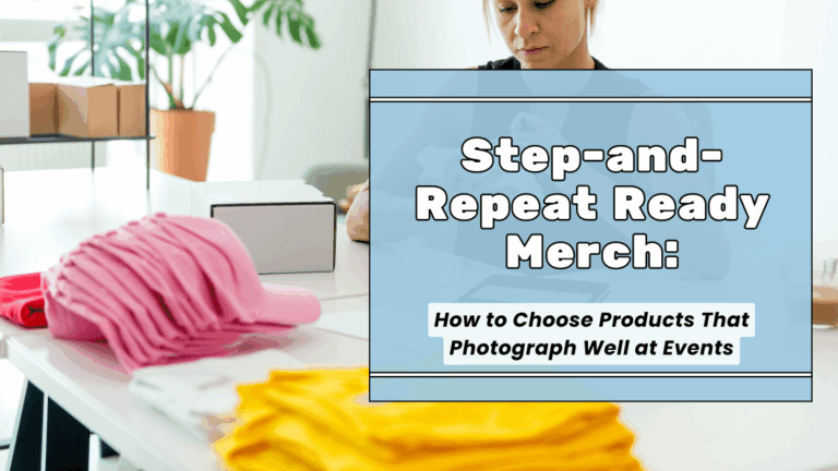
The Best Products for Quick Personalization
Not every item is built for live customization. The best products are the ones that can take a short line of text, a monogram, or a simple graphic in a clearly defined area.
Some of our favorite fast-moving options include:
- Hats for initials, names, or short words on the front panel
- Totes for one-line personalization or a curated add-on beneath an existing logo
- Tumblers for sleek engraving, especially when the placement area is already mapped out
- Sports accessories like custom football towels when the event audience wants something functional, branded, and easy to grab
- Pre-designed celebration merch, like the kind featured in this Wesleyan University championship project, where the assortment feels cohesive and the personalization layer stays simple
And here is the honest truth: some products are better for partial personalization than full customization. A category like pillows for events can still be part of a personalization-driven experience, but it works best when the artwork system is locked in ahead of time and the live choice is limited to a name, short phrase, or approved colorway.
The best on-site items share three traits. They have a predictable print area, they look good with minimal copy, and they do not require the operator to reinvent the layout every single time.
Fonts That Print Fast and Stay Legible
If you want speed, start with fonts that behave.
The fastest fonts are clean, balanced, and easy to read at a glance. For embroidery, engraving, and quick print applications, simple sans serif fonts are usually the safest lane. Think modern, sturdy, and not overly delicate. You want letters that hold their shape, especially at smaller sizes.
What tends to work best:
- geometric sans serif fonts
- straightforward block fonts
- clean monoline styles with enough weight
- simple serif fonts only when the size is generous
What slows everything down:
- ultra-thin strokes
- distressed fonts
- exaggerated scripts
- fonts with lots of swashes or tight interior details
- high-contrast letterforms that disappear when reduced
This matters even more in embroidery. If the lettering is too small or too thin, the result can get muddy fast. A good rule is to choose type that still looks confident from a few feet away, not just on your screen at 300% zoom. If you are prepping artwork, Adobe’s screen-print file guidance is a good reminder that text needs to be production-ready, not just visually appealing.
Readability matters, too. The W3C’s contrast guidance is technically about accessibility, but the same principle absolutely helps event merch. Small text with weak contrast is harder to read, harder to approve quickly, and more likely to trigger re-dos.
Pro tip: for live stations, give guests three font options max. One bold, one clean, one slightly elevated. That is enough.
Placement Rules That Reduce Errors
Placement should never be decided on the fly.
The second your operator has to ask, “Do you want that centered, slightly higher, or off to the side?” you have added drag to the line. Smart activations use locked placement rules before the first guest walks up.
A few dependable zones:
- Left chest: classic, fast, and low-risk for polos, tees, and lightweight outerwear
- Hat front panel: great for initials, short names, and compact icons
- Sleeve or side placement: stylish, but best only when the template is already set
- Back yoke or upper back: works for larger text, but usually slower and less ideal for quick throughput
If you want a baseline for apparel placement, Stahls’ design placement guidance is useful for standard zones and sizing logic. The point is not to follow every measurement like a robot. The point is to standardize enough that your team is not guessing.
Here is the move that keeps things clean: one product, one approved placement zone, one fallback placement if needed.
That way, if a guest chooses a long name that will not fit beautifully in zone A, the operator already knows the approved alternative. No debate. No bottleneck. No awkward station pause.
Limit Personalization Options (Without Making It Feel Limited)
This is where branding and psychology meet.
Guests do not need endless choices. They need curated choices that feel intentional. The best personalization menus feel premium because they are edited well, not because they are huge.
Instead of offering:
- 12 fonts
- 8 placements
- every thread color in the cabinet
- custom phrases of any length
Offer:
- 3 fonts
- 1 or 2 placements
- 4 approved colors
- first name, initials, or a short curated phrase menu
That still feels personal. It just feels guided.
A strong curated menu might look like this:
Choose one text style
- Initials
- First name
- Two-word phrase from approved list
Choose one format
- Block
- Modern
- Signature
Choose one color
- White
- Black
- Metallic
- Brand accent
This is the sweet spot. Guests still feel ownership, but the production team stays in control.
Set Minimum and Maximum Character Counts
Character counts are one of the easiest ways to protect both quality and speed.
When there is no limit, people will test you. They will try to fit a full quote, nickname, date, city, and inside joke onto a product that looks best with eight clean characters. That is how beautiful merch turns into cramped merch.
Set rules by product, not by vibe.
For example:
- hats: 3 to 10 characters
- tumblers: 8 to 14 characters depending on the layout
- totes: 1 line, max 12 to 16 characters
- towels: initials or short surnames only
Also set minimums. A single lowercase letter floating in a huge print area can look accidental. Sometimes the design looks better when you require two or three characters minimum for a given layout.
The best activations treat character limits as part of the creative system, not a restriction added later.
Pro tip: write the limit directly on the order card or screen. Guests accept rules more easily when the system feels established.
Color Rules That Keep Production Moving
Color indecision is real, and it quietly destroys throughput.
A smart live personalization program narrows color choices hard. The fastest stations usually win with one-color production or a very tight approved palette. This keeps the visual identity clean and reduces setup changes, thread swaps, and second-guessing.
Your color rules should do three things:
- match the brand system
- create enough contrast to stay legible
- reduce production changes during the event
That means no giant rainbow menu unless the event absolutely calls for it. One neutral, one dark, one light, and one statement color is usually plenty.
This is especially true when you are personalizing darker products. Strong contrast helps guests approve faster because they can actually picture the finished result. Again, this is where that W3C contrast principle becomes surprisingly useful in merch planning.
Proofing at the Station: Quick Visual Confirmation System
The fastest way to avoid a remake is to prevent the mistake before production starts.
Every live station should have a quick visual confirmation system. Not a long approval ritual. Just a clean checkpoint.
A simple proofing flow:
- Guest submits name or initials
- Staff enters selection into the preset template
- Guest confirms spelling, font, placement, and color
- Staff repeats it back once
- Production begins
That is it.
You do not need a fancy overbuilt proofing system if your template rules are already disciplined. You just need a moment of confirmation that catches spelling errors, wrong case, or accidental over-length requests before the machine starts.
Best practice: use a ticket or tablet view that mirrors the actual production format as closely as possible. The closer the preview feels to the final result, the fewer surprises you get.
Templates and File Prep That Prevents Delays
This part is not glamorous, but it is where the event either flows or falls apart.
If the artwork files are messy, live personalization gets slow fast. Production-ready templates should already account for placement, max line length, safe area, and approved style options before the event opens.
A good template pack includes:
- master layout for each product
- locked print or embroidery zone
- preset font menu
- approved color palette
- outlined text when needed
- version control so nobody grabs the wrong file
On the artwork side, clean files matter. Adobe’s vector vs. raster explanation is still one of the simplest reminders of why logos and scalable graphics should stay in vector whenever possible. Vector art keeps its quality when resized, which is exactly what you want when the same brand asset is being adapted across hats, totes, towels, and drinkware.
And when the design is heading into print production, Adobe’s prep guidance is a solid checkpoint: outline the text, organize same-color elements, and make the file easy for production to interpret quickly.
Because at an event, every extra second spent fixing a file is a second your line is not moving.
Fast Personalization Comes From Simple Rules and Great Templates
The brands that win with on-site personalization are not the ones doing the most. They are the ones editing the experience well. Clean products, clear fonts, locked placements, tight character counts, controlled colors, and a fast proofing system make the whole thing feel elevated.
That is the real flex.
When the guest experience feels effortless, the merch feels more premium. And when the merch feels premium, people keep it, wear it, post it, and remember who gave it to them.
Short takeaway
If you want fast on-site personalization, do less on purpose. Fewer options, better templates, clearer rules, and smarter product selection will always beat a chaotic customization menu.