If you have ever wondered why some campus merch becomes a daily staple and other merch becomes a cleaning rag, it usually comes down to one thing: identity.
In a consumer survey in the promotional products industry, nearly half of the respondents reported keeping promotional products for more than five years, with usefulness as the top reason. That same logic is exactly why the best collegiate apparel works.
When your design feels like the school, not like a template, students actually wear it, they post it, and it becomes part of campus culture.
At JNP Merchandising, we approach school spirit the same way we approach luxury branding. It is not about slapping a logo on a tee.
It is about translating personality into wearable, collectible, and effortlessly cool products.
Why School Identity Is the Best Source of Wearable Merch Ideas
The quickest way to design standout college merch is to stop brainstorming in a vacuum. Your campus is already a brand world. It has icons, rituals, places, language, and an emotional rhythm that students feel every day.
When designs are rooted in school identity, they do three things really well:
- They create instant belonging. The student recognizes the reference and feels like the merch is for them.
- They stay relevant longer than trends. A meme dies fast. A landmark, mascot, or tradition lasts for decades.
- They tell a story without overexplaining. The design becomes a memory trigger, which is the secret to repeat wear.
A simple way to start is a 10 minute “identity pull,” and you can do it with a notes app:
- Three icons: mascot elements, colors, a seal, a lettermark, a team nickname.
- Three places: a landmark building, a stadium detail, a view, a courtyard, a street around campus.
- Three moments: a chant, a tradition, a rivalry, a late night ritual, a campus joke everyone shares.
Those nine items can fuel an entire semester of drops if you mix them thoughtfully.
Merch built from identity will always outperform merch built from generic inspiration boards.
Mascot-Based Designs That Feel Fresh (Not Childish)
Mascots are powerful, but the execution has to grow up with the student. Nobody wants to look like they are wearing a youth league tee on a Tuesday.
Here is how you keep the mascot energy while making it feel modern:
- Use mascot fragments instead of full faces. A paw print, a horn silhouette, a tail curve, a wing shape. It reads like design, not like a cartoon.
- Pull from vintage marks. Older mascot illustrations often have more character. Clean them up, simplify the linework, and pair them with elevated type.
- Go tonal and textural. Monochrome screenprint, tonal embroidery, chenille patches, or a raised puff detail can make the same mascot reference feel premium.
- Build a mascot “system,” not a single graphic. Create three supporting icons that can show up across hats, tees, stickers, and tags. Consistency makes everything feel like a collection.
A practical checkpoint: if a senior would not wear it off campus, the mascot is probably too loud, too literal, or too crowded.
Modern mascot merch is less about shrinking the logo and more about redesigning the mascot into a symbol students actually want in their everyday rotation.
How to Turn Campus Landmarks Into Iconic Graphics
Landmarks are one of the cleanest ways to make merch feel specific and elevated. Students might not always wear the official crest, but they will happily wear a graphic that captures “that place” where campus life happens.
High-performing landmark concepts usually fall into a few styles:
- Architectural line art. Minimal line drawings look premium on crewnecks, quarter-zips, and caps. A clean line illustration also scales well, which matters for embroidery and small placements.
- Silhouettes and badges. If the landmark is recognizable, the outline alone can do the job. Put it in a badge shape with the school name and a year.
- Coordinates and map cues. Coordinates, street names, or a tiny map grid feels like streetwear and still stays school-coded.
- Poster-style illustration. Bold shapes and simplified color blocks can turn a campus building into a collectible graphic.
The biggest mistake is trying to cram the entire campus into one design. Pick one landmark and make it iconic. Let it breathe. Pair it with a confident wordmark or a short phrase that students actually say.
The best landmark graphics are not the prettiest buildings. They are the places students have stories about.
Inside Jokes and Traditions: Making Merch Students Actually Want
Inside jokes are where merch goes from “school store” to “instant sellout.” They make students feel like the merch was made by someone who actually goes there, not by someone guessing from a distance.
The trick is choosing jokes and traditions that are:
- Widely known on campus
- Harmless and inclusive
- Easy to translate into design
- Still funny when printed
Great sources for inside jokes:
- Orientation week phrases everyone heard 100 times
- A legendary campus food item people love to hate
- A nickname for a specific location
- Rivalry week rituals
- Finals week survival culture
Design-wise, keep it tight. A short phrase paired with a simple icon usually wins. If the joke needs a paragraph to explain, it will not work on a hoodie.
If you want the fastest route to authenticity, do not guess. Ask. A quick student roundtable with people from different circles will give you the references that are actually alive this year.
The best inside joke merch feels like a secret handshake and still looks good on a hanger.
Balancing “In-The-Know” References With Broad Appeal
You want that “if you know, you know” feeling, but you also want the merch to be wearable by athletes, club kids, commuters, alumni, and parents. The solution is layering.
Use a two-speed design approach:
- Speed one: instantly wearable. Clean composition, good typography, a graphic that looks strong even if you do not know the reference.
- Speed two: the reward for insiders. A sleeve detail, a hem tag phrase, a tiny coordinate, a date, a micro icon.
This is how you keep an inside joke from becoming confusing. The merch reads as premium first and clever second.
Also, be mindful of what not to do. Avoid references tied to private incidents, anything that could target a group, or jokes that depend on embarrassing someone. The goal is to bond the campus, not divide it.
If you have to explain the joke for it to be funny, it is not a merch concept. It is a conversation.
Using Slogans, Chants, and Typography to Build Identity
Typography is one of the easiest ways to make campus merch feel elevated without over-designing it. It is also one of the easiest ways to make it feel cheap if spacing and hierarchy are sloppy.
A strong type-driven design usually includes:
- One headline phrase. The chant, the rally cry, the motto students actually use.
- One supporting detail. School name, location, year, or a short subline.
- A consistent typographic system. Two fonts max, intentional spacing, and repeatable alignment rules.
Streetwear-leaning ways to make typography feel current:
- Oversized back prints with a small front hit
- Stacked wordmarks that feel like a band tee, but collegiate
- Microtype blocks with location, year, and a subtle icon
- Clean varsity type paired with one unexpected modern detail
Typography sells when it feels intentional. It should look like a designed poster, not like someone typed words on a shirt.
One headline, clean spacing, confident layout. That is the formula.
Illustration Styles That Match the School’s Vibe
Every school has an aesthetic. Your illustration style should match it, not fight it.
Here is a quick way to align design style with campus personality:
- Classic and preppy: heritage crests, varsity layouts, refined vintage marks.
- Modern and design-forward: minimalist line art, negative space, tonal palettes.
- Retro and nostalgic: washed inks, aged textures, throwback type, old-school mascot treatments.
- Regionally influenced: western, coastal, mountain, desert cues that feel true to the place.
- Urban and fashion-led: oversized placements, tonal branding, clean icon systems, elevated blanks.
If you are building multiple pieces, create a small “style kit” for the semester: two fonts, a core icon shape, one illustration method, and a clear grid. Cohesion makes everything feel like a drop, not random merch.
The best illustration style is the one that feels like your campus, not the one that is trending somewhere else.
Making Designs Wearable: Subtle Branding and Clean Layouts
Wearable merch is merch that works with real outfits. Students will not wear something that feels like a billboard unless it is for a very specific moment.
A few layout approaches that consistently work:
- Small left-chest hit plus a larger back graphic
- Sleeve detail with a year, coordinate, or tiny icon
- Minimal front with a bold back wordmark
- Tonal print that feels premium and understated
Decoration choices matter too:
- Embroidery reads premium and timeless.
- Screenprint can be bold, crisp, and high-impact when the art is clean.
- Puff ink adds texture, but only works when the design is simple enough to carry it.
One more thing: quality blanks and fit are not optional if you want repeat wear. A great design on a cheap blank still reads cheap.
Clean layout, subtle branding, better blanks. That is how you get the “worn twice a week” effect.
Product Mix: Where Mascots and Landmarks Work Best
Different identity elements shine on different products. When you match concept to product, you raise the odds that students actually use it.
A smart campus product mix looks like this:
- Graphic tees: best for landmarks, slogans, and story-driven artwork.
- Hats and caps: perfect for simplified mascot marks, small icons, and tonal embroidery.
- Crewnecks and hoodies: ideal for heritage layouts, line art, and premium textures like chenille.
- Totes: great for inside jokes, event drops, and lifestyle visuals.
- Stickers: perfect for micro references and orientation packs, plus they spread across laptops and water bottles.
Event-driven items are also underrated. If you want instant visibility in the stands and in photos, build a design that looks great in motion. Something as simple as custom football towels can become a signature piece when it carries a clean chant line, a subtle mascot mark, and a bold type system that reads from a distance.
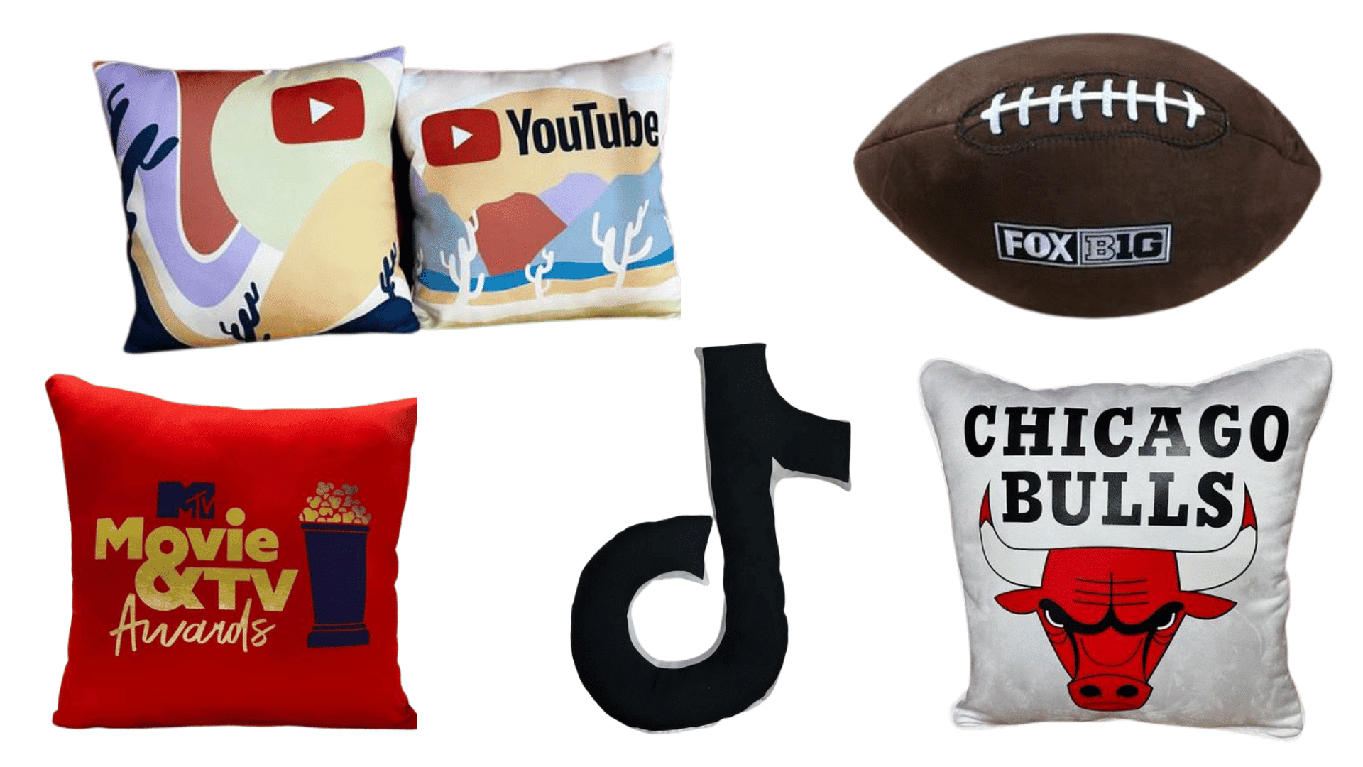
And for dorm life, alumni weekends, and VIP gifting, soft goods win because they feel like comfort, not advertising. Landmark graphics look especially good on cozy items like pillows for events, since they turn campus identity into something people actually live with.
The right product mix turns school identity into a full lifestyle collection, not a single shirt.
Legal and Brand Approval Basics
This is the part that is not glamorous, but it is essential. School merch lives in a world of trademarks, licensing, and brand rules. Getting this wrong can delay production, block a launch, or create real legal exposure.
The basics to know:
- Trademarks apply to more than logos. Wordmarks, mascots, seals, and even certain phrases can be protected. Start with the fundamentals from the USPTO trademark basics.
- Many schools require licensed vendors. A common pathway runs through CLC, which manages licensing programs for many institutions. If you are building product for campus distribution or retail, the CLC licensing process is a useful overview of how approvals often work.
- Sports and championships can add another layer. If your design references NCAA marks or championship events, review NCAA guidance like the NCAA licensing page so you understand what is controlled at the national level versus the school level.
- Schools may publish licensing and usage expectations. Examples include the UC Davis licensing overview and Stanford University guidance through its trademark licensing page.
From a process standpoint, plan for approvals early. Do not design on Monday for an event next Friday and expect smooth sailing. Licensing timelines are real.
If the date matters, start the approval process first, then design around what will actually clear.
Testing Concepts With Students Before You Produce
Testing is the move that separates “cute ideas” from merch that actually sells out. You do not need a huge research budget. You need fast feedback loops.
Ways to test efficiently:
- Two-option polls. Put two concepts in a story poll. Ask “Which would you wear?” not “Do you like it?”
- Ambassador circle. A small group across athletics, clubs, Greek life, and commuters will keep you honest.
- Pre-order validation. If people pay during a short pre-order window, you have proof before you invest in inventory.
- Micro try-on content. Mock up the design on a tee and post it as a quick video. Watch saves and shares, not just likes.
Also, look for silent feedback. If students hesitate, it often means the design feels too loud, too basic, or too forced.
The best student feedback does not just pick a winner. It tells you why people would actually wear it.
Bringing It to Life With Visuals and Storytelling
Design gets people interested. Storytelling gets people obsessed.
A few content plays that consistently work for campus merch:
- Landmark backdrop photos: shoot the landmark graphic in front of the real landmark. It turns the design into a moment.
- Real student styling: show the merch styled like students actually dress, not like a catalog.
- Fast try-on videos: keep it simple, quick transitions, a clean soundtrack, and honest reactions.
- UGC loops: encourage students to post fits, reshare them, and make the community part of the rollout.
This is where identity-based merch really wins: it is inherently photogenic because it is tied to real campus life.
If you want a concrete example of school pride turned into merch people were genuinely excited to wear, check out our Wesleyan University championship celebration case study: Wesleyan University 2022 NESCAC Men’s Basketball Champions. It is a great reminder that the best merch drops do not just look good. They mark something meaningful.
Strong visuals plus a real story turn merch into culture, and culture is what makes designs travel beyond campus.
The Best Collegiate Merch Feels Like the School’s Personality
Standout collegiate merch does not come from guessing what is cool. It comes from paying attention to what already makes the school feel like itself. Mascots feel fresh when you treat them like design symbols, not cartoons. Landmarks become iconic when you pick one story-rich place and keep the layout clean. Inside jokes sell when they are inclusive, simple, and genuinely campus-wide. Then you build the right product mix, clear licensing, test with students, and launch with visuals that make the identity feel alive.
The best collegiate merch feels like the school’s personality because it is built from it.