If branded merch has ever felt like “free stuff,” it is usually because it was designed like free stuff. The fun part is that the data says people notice the difference fast.
In a recent promo study, nearly 9 in 10 consumers said design influences whether they keep a product, which is basically your cue to stop treating apparel like an afterthought and start treating it like a mini fashion line (PPAI’s 5-Second Impact research).
Regional aesthetics are one of the cleanest ways to get there because they give your collection a point of view, not just a logo.
What “Regional Aesthetic” Means in Apparel Design
A regional aesthetic is not “put the city name on a tee.” It is the visual language people associate with a place: the landscapes, the architecture, the textures, the color temperature, the signage, the pace of life.
Think of it like building a playlist. You are not choosing one song. You are curating a vibe that repeats across multiple tracks, and every piece in the drop sounds like it belongs.
Quick framework (the JNP way):
- Place cues: terrain, weather, local materials, local sports culture, neighborhoods.
- Design cues: icon style, line weight, texture, color palette, type.
- Lifestyle cues: what people actually do there (hike, surf, ride, commute, tailgate, café-hop).
Pro tip: pull 10 reference photos from the region that have nothing to do with merch. Street signs, storefronts, trail maps, old postcards, matchbooks, diner menus. That is where the good stuff lives.
Why Regional-Inspired Merch Feels More Authentic Than Generic Swag
Generic swag is loud branding on a product nobody asked for. Regional merch feels like something you would buy even if it was not free, because it connects to identity and memory.
That matters because the strongest merch does two jobs at once:
- It represents the brand.
- It represents the person wearing it.
When you nail the aesthetic, you also get social proof on autopilot. People wear it, friends ask where it is from, and your brand travels without you paying for impressions.
If you want a real-life example of “merch that feels like a moment,” look at how JNP helped celebrate a championship with a cohesive mix of gear in this Wesleyan University championship totes and shirts project. The takeaway is simple: when the design is connected to the story, the merch becomes part of the memory.
Western-Inspired Apparel: Key Design Elements That Read “Modern”
Western is having a moment, but the modern version is not costume-y. It is less “theme party,” more “clean Americana.”
Modern western elements that hit without trying too hard:
- Line art icons: subtle horseshoe, rope loop, star, spurs, desert bloom.
- Topographic details: map lines, elevation marks, trail-style labeling.
- Heritage layouts: small chest hit, big back print, or sleeve detail.
- Patch vibes: woven label energy, tonal embroidery, understated placement.
- Colorways: bone, sand, tobacco, faded black, vintage navy, clay.
The #1 modern western rule: if the graphic looks like it belongs on a souvenir rack, simplify it. Reduce colors. Clean the outlines. Swap the giant cowboy illustration for one strong symbol plus great type.
Pro tip: use “western” as an influence, not a costume. The second it feels like a character, the fashion audience checks out.
Beyond Western: Other Regional Styles That Translate Well to Merch
Western is just one lane. You can build a whole merch world by matching the region to how your audience lives.
Coastal
- Washed blues, sun-faded neutrals, minimal icons (wave line, buoy, coordinates).
- Light embroidery, breathable tees, relaxed fits.
Desert
- Dusty palettes, heat-haze gradients, strong negative space.
- Vintage postcards, geometrics, cactus silhouettes done clean.
Mountain
- Topo maps, altitude callouts, trail badge systems, utility styling.
- Heavyweight tees, fleece, beanies, understated embroidery.
City street
- Transit-inspired graphics, neighborhood shorthand, micro type, sticker-collage energy.
- Black and white base, punchy accent color, bolder layout grid.
If you want trend context for why “regional nuance” matters, the fashion world has been talking for years about adapting to local preferences rather than pushing one global look (McKinsey’s State of Fashion reporting).
Building a Visual System From a Region (Icons, Colors, Texture)
This is where the collection stops being “random cute pieces” and starts looking like a brand.
Build your system in three layers:
- Icon set: 8 to 12 icons in one style (all outline, or all filled, same corner radius, same line weight).
- Palette: 1 base neutral, 2 supporting neutrals, 1 accent color. Optional: one “seasonal” accent for drops.
- Texture: one signature texture (grain, halftone, vintage fade, screenprint crackle) used sparingly.
Pro tip: pick one “hero motif” from the region and repeat it across products. Example: a rope loop becomes a border frame, a sleeve detail, a hat embroidery, and a hangtag pattern. That repetition is what makes it feel expensive.
Typography Choices That Match Regional Vibes
Typography is the fastest way to communicate place without using a literal landmark.
Type direction cheat codes:
- Modern western: slab serif, condensed serif, or a clean serif with subtle flair. Keep it tight, not cartoonish.
- Coastal: clean sans, wide tracking, airy spacing. Let it breathe.
- Mountain: sturdy sans, slightly condensed, “badge label” hierarchy.
- City: bold grotesk sans, stacked type, small microcopy like transit posters.
Two rules we live by in apparel:
- Legibility wins. If the type is not readable from six feet away, it is decoration, not branding.
- One hero font. Support it with a neutral secondary. Too many typefaces makes it look like a flyer.
Pro tip: put the logo on the inside neck print and let the front graphic be a lifestyle statement. Subtle branding reads premium.
Fabric, Fit, and Colorways That Support the Aesthetic
A regional aesthetic is not just visuals. Fit and fabric are part of the vibe. A desert capsule on stiff, bright-white tees feels off. A city streetwear capsule on thin, clingy fabric also feels off.
What usually works for premium, lifestyle-forward merch:
- Garment-dyed and washed looks for vintage, regional authenticity.
- Heavier-weight tees for structure, drape, and that “real brand” feel.
- Relaxed or slightly oversized fits for modern styling and comfort.
- Neutral-forward colorways that match the environment (sand, stone, sage, charcoal).
Pro tip: match color names to the place in your product naming. “Canyon Clay,” “Fog Gray,” “High Desert Sand.” It is a tiny detail, but it makes the whole drop feel curated.
Turning Landmarks and Local References Into Wearable Graphics
Landmarks are powerful, but literal can get cheesy fast. The move is to turn landmarks into symbols, patterns, or shorthand.
Wearable ways to do it:
- Coordinates and elevation instead of the full landmark drawing.
- Abstract silhouettes with clean geometry.
- Local phrases (not tourist slogans) in a typographic layout.
- Map snippets or trail markers as small placements.
Also, do your homework on usage rights when you are referencing names, logos, or recognizable marks. If you are building a merch line tied to a venue, event, campus, or well-known destination, you want to be thoughtful about trademarks and permissions (USPTO trademark basics).
Pro tip: the more “brandable” a landmark is, the more likely it has some kind of protected mark associated with it. When in doubt, keep it original and illustrative, not copy-paste literal.
Avoiding Clichés and Cultural Missteps
Here is the honest truth: “regional” and “cultural” can overlap. That is where the work has to be respectful, not just trendy.
A simple guideline: if a design element comes from a living culture (especially Indigenous communities), treat it like collaboration, not inspiration. There are real frameworks for this, including fashion-specific guidance on engaging with Indigenous communities and their cultural expressions (WIPO’s fashion steps draft) and broader context on traditional cultural expressions (WIPO overview).
Brand-safe practices that keep you out of trouble:
- Source your references responsibly. If you cannot explain where a symbol comes from, do not use it.
- Avoid sacred motifs and ceremonial elements. Period.
- Collaborate when culture is the core. Partner, license, share credit, share value.
- Be careful with claims. Do not label something “Native-made” or tied to a specific tribe unless it is true and verified (in the U.S., misrepresentation can trigger serious legal consequences under the Indian Arts and Crafts Act, which is a truth-in-advertising law) (U.S. Department of the Interior guidance).
Pro tip: “inspired by” is not a shield. Respect and clarity are what protect the brand.
Product Mix That Fits Regional Lifestyle (Not Just Tees)
A real merch collection looks like a closet, not a single item. The product mix should match how people live in that region.
Build your mix like this:
- Anchor piece: heavyweight tee or hoodie that carries the hero design.
- Everyday accessory: embroidered hat, beanie, or tote.
- Unexpected flex: something that feels lifestyle-specific.
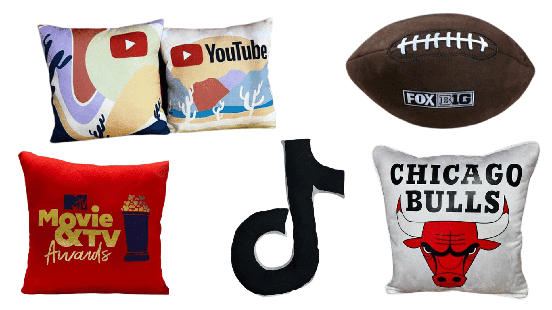
If your region has sports culture or game-day energy, go beyond the shirt. A stadium-ready drop hits harder with add-ons like custom football towels that feel intentional, not random.
If your vibe is hospitality, lounges, or experiential events, soft goods are elite. Think tactile, cozy, photogenic pieces like event-ready pillows that people actually keep in their home, not just in a drawer.
Pro tip: choose fewer items, but upgrade quality. A small, premium assortment always beats a giant pile of forgettable stuff.
Limited Drops vs Evergreen Lines for Regional Merch
You have two winning plays, and the best brands usually run both.
Evergreen line (always available):
- Minimal, timeless, logo-light.
- Core colorways.
- Perfect for onboarding, welcome kits, and consistent brand presence.
Limited drops (seasonal or moment-based):
- Region-specific stories: “Desert Nights,” “Fog Season,” “Trail Week,” “Rodeo Weekend.”
- Bolder graphics, limited colors, numbered run.
- Designed to sell out and create “I missed it” energy.
Pro tip: drop strategy is easier when you already built a visual system. Icons, palette, and type are your engine. The story is just the fuel.
Making It Social-First: Photography and Content That Matches the Region
If the aesthetic is regional, your content should be regional too. Nothing kills the vibe faster than desert merch shot in a fluorescent office.
Social-first content checklist:
- Shoot on-location or match the textures (wood, concrete, sand, brick).
- Style it like real outfits. Layer with denim, boots, workwear, and sneakers depending on the region.
- Move shots matter. Walking clips, candid laughs, hands in pockets, coffee-in-hand.
- UGC prompts: “Show us your favorite trail,” “Game day fit check,” “Neighborhood uniform.”
Pro tip: give people a reason to post beyond “look at my shirt.” Tie it to place, ritual, and identity. That is how merch becomes culture.
Regional Aesthetics Turn Branded Apparel Into Real Style
Regional aesthetics make branded apparel feel like real style because they give your merch a point of view. Western-inspired is just one doorway. The bigger opportunity is translating place into a wearable system that looks premium, feels intentional, and actually matches how your audience lives.
Short takeaway (save this):
- Start with place cues, then build a repeatable system (icons, palette, texture, type).
- Keep branding subtle and readable, and let the aesthetic do the talking.
- Match fabric, fit, and colorways to the region, not to what is cheapest.
- Expand beyond tees with lifestyle pieces that make sense for the audience.
- Be respectful with culture, and collaborate when it is not yours to borrow.
If you want your next collection to feel like something people would buy even if it was not free, that is the standard we build to at JNP. The merch should not scream “promo.” It should whisper, “This brand gets it.”